Once upon a time I wanted to be a syndicated cartoonist and make lots of money, or become an animator, like Chuck Jones, and make millions of people laugh. Now I'm content being a lackadaisical part-time caricaturist. But for this reason I'll never reach the calligraphic heights of my idol, Mort Drucker.
As most people know, Mort Drucker is the Michelangelo of caricaturists - from any century. He joined Mad Magazine in 1957 and has been, by far, the best satirical illustrator to ever grace the pages of a magazine. His naturalistic style and supreme draftsmanship have influenced literally thousands of artists, and his movie satires for Mad are as memorable as the movies themselves.
His Godfather parody is one of his personal favourites; below is a detail of the original art work. Drucker's trademark use of expressive hands are in evidence here. He creates them (and everything that he draws) with minimal pencil work. His penmanship and knowledge of hand construction is without peer. Even Charles Schulz rhapsodized about Mort's 'handiwork' and wished he could draw hands like him.
I once visited the great man at his home in Woodbury, New York in the the late 80's. It was a bit like knocking on G. F. Handel's door while he was knocking off some oratorio; I was witness to the spare bit of pencil on his Strathmore paper just before he was going to ink the likes of Tom Cruise, Paul Newman, and Whoopi Goldberg. It was as though he had just written a figured bass, and was about to extemporize with a magical crowquill pen and India ink. "You're finished the pencil?!" I asked, incredulously. The Master humbly replied: "Yup." The inked result is what you see below - one of the many Mad Hollywood satires.
Mort Drucker told me that everything had to do with texture - something he's always striving for: "Hair has to look like hair; flesh like flesh..." Texture in Drucker's work is something that was evident to me since I was a kid - copying his work. I tried to draw brick walls like he drew in 'The Sting,' tweed and herringbone jackets, as he had drawn in so many satires; black leather, as in his jackets or shoes. But it always came back to the texture of the skin, the texture of the hair, and always, those miraculous hands. There have been hundreds of imitators, but no one with the unerring skill and sheer bravado of line. Below is an example from Drucker's satire of Rob Reiner's 'Stand by Me.' It contains many different textures and an exceptional, intuitive sense of form, volume and space.
We talked for hours about many cartoonists, including my late friend Jim Unger, of Herman fame. Drucker asked if I knew Lynn Johnston...I didn't know her then, but certainly got to know her once she moved to North Bay. My visit was coming to an end; I had been chatting for three hours with the mentor of my youth - one of the great artists of the twentieth century - and perhaps one of the nicest people I've ever met. Something I finally had to ask: I'm sure many artists have wondered this about Drucker, because he really comes across as a true original - I can't think of anyone quite like him. "You've influenced everybody on the planet, but who influenced you?" I was expecting him to name some completely unknown caricaturist from the 19th century - whether he be English, Italian, German, or French - maybe Kley or Daumier. His answer took me by surprise: "Oh, that's easy...Ronald Searle!" Of course - one of my favourite illustrators, and it never even occurred to me. (Searle died in Paris barely a couple of years ago, in his 90's). Searle's skritchy-scratchy, feathery lines occasionally do show up in Drucker's work, and sometimes the Mad artist pays complete homage to him in some of his spot-character designs. Here's another piece in my collection, by Ronald Searle
Below is a Mad cover by Mort Drucker: Al Pacino as 'Serpico' and Dennis Weaver as 'McCloud.'
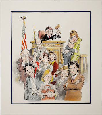
Drucker has said he's a little uncomfortable when using colour - it's always new territory for him, since he's been a black and white fellow most of his life. But his experimentation in colour has led him to Dr. Martin's coloured inks, which he dilutes and uses in a painterly fashion. Here's a scan of the Mad original of the entire cast from 'LA Law' - the colour has been used more sparingly; it's not as opaque as the Serpico cover.
A comprehensive book of Mort Drucker's work for Mad Magazine has just been released as of this past week. The several Forwards have been written by leading filmmakers:
Steven Spielberg, Director, Jaws
"Mort Drucker's timely sense of parody mixed with commentary first made me aware of the culture of our generation. Mort's irreverent and historical caricatures have never been nor will they ever be equaled. He poked fun at all my favorite movies when I was a teenager and when I was a filmmaker, he started going to town on the ones I was making and I loved every frame of his."
Joe Dante, Director, Gremlins
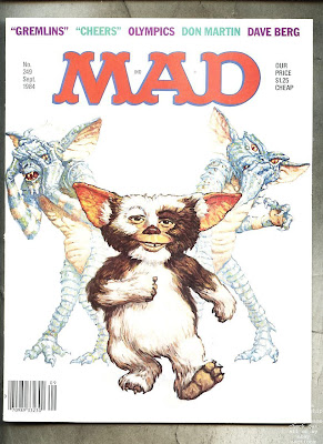
As a lifelong MAD devotee from the time it was a four-color comic, I can tell you that there are few thrills in life quite like seeing your own movie parodied in the pages of MAD! So you can imagine my shock and glee when I glommed on to the cover of the September 1984 “Grimlins” issue with Alfred E. Neuman as Gizmo, surrounded by horrified Gremlins holding their noses behind him. And even better, what was inside was almost too good to be true: several hilarious pages of clever spoofery by Stan Hart illustrated with the usual brilliant Mort Drucker comic art!
What an honor.
Let’s be clear—Mort Drucker is simply right up there with Hirshfeld as the master American caricaturist.
His pure, unmistakable graphic style has captured an astonishing array of 20th century celebrities and public figures. Even if you didn't know a performer’s name you could always place the face. His movie-like staging and composition were unmatched, and the result was artwork that could be revisited time and time again and still yield something new. That particular facet of MAD influenced many nascent filmmakers, including myself.
I never actually met the absurdly prolific Mr. Drucker, but I feel I know him through his years of work.
Now there’s a legacy few of us can even aspire to!
George Lucas, Director, American Graffiti
Since I first read MAD Magazine as a kid, I've been drawn in by its mix of highbrow satire and lowbrow laughs that pokes very funny holes in the stuffiest of institutions. Mort Drucker's signature artwork captures and exaggerates the world around us and the people in it in a way that makes them more real. His caricatures are the best, and he is the artist that defines MAD for me.
When I had to choose an artist for the American Graffiti poster, Mort was the first and only person who came to mind. Since then, he's been redrawing my movies as funny parodies. You never mind being the subject of one of Mort's jokes, because he executes them so artfully.
JJ Abrams, Filmmaker
The influence of Mort Drucker on readers of MAD Magazine cannot be overstated. I remember with vivid clarity sitting in my elementary school classroom, while I was supposed to be working, desperately trying to copy his brilliant caricature style. It didn’t work. Not then and not now. Drucker’s eerie ability to absolutely capture the heart and soul of his subjects—and put them in hysterical tableau—is unmatched by anyone. Even the way he signed his work was something of inspiration; I remember as a kid trying to create my own signature in a style as cool as Drucker’s. I wished I had an “M” and an “O” in my name so I could do the three lines and circle thing like he did. I am and always was, like so many others, a huge fan of Mort Drucker. One of the greatest comic artists of all time.


1 comment:
Dear Kevin,I'm assembling a book on Ronald Searle and his American era work. I got to know him before he died and have the blessing and support of his family and Estate. I'd love to include your raccoon picture. Please email me at the address in my Blogger profile if you'd be happy t include it.
Matt
http://ronaldsearle.blogspot.com
Post a Comment